This outstanding video from TED may be one of the most insightful presentations I've heard on the relationship between culture and consumer choice.

Sheena Iyengar dispenses with the consumer focus group and leaves behind some of the more obsolete but dearly loved quantitative testing methods so popular among marketers today. Instead, she dives deep into the the psychocultural motivations behind the act of choosing. Iyengar's research has been informing business and consumer-goods marketing since the 1990s and has produced material for writers like Malcolm Gladwell. All of which makes me think that her new book, the Art of Choosing is well worth buying.


Sheena Iyengar on the art of choosing | Video on TED.com


Article: Creative Commons License 2010 Gavin Barrett
This work is licensed under a Creative Commons Attribution-Noncommercial 2.5 Canada License.


A simple smart advertising campaign can go a long way towards converting drivers to riders.
Luck led me to this posting on sustainable urban transportation blog, The City Fix.

One campaign in particular caught my eye - the comparative, good vs. bad, cars vs. buses Go Metro ads made their point with clarity and immediacy. I went hunting for the rest of the campaign and found a treasure trove at another blog Long Winded and Proud.

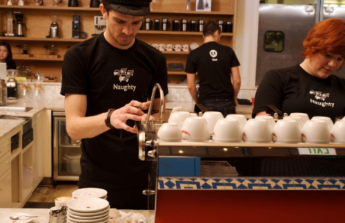
Check out the Naughty vs Nice t-shirts they distributed to baristas - a lovely grassroots touch.

Images via The City Fix and Long Winded and Proud.
Article and blog, copyright Gavin Barrett 2010.

Creative Commons Licence
This work is licensed under a Creative Commons Licence.


Züm is Brampton Transit's new bus rapid transit brand, carefully developed through a year-long process that included stakeholder interviews, best practice reviews and town council approvals. Appropriately enough for a transit service, Züm has an origin and a destination. Züm began its journey in the idea of a speedy, urban, world-class, rapid, modern, forward-looking, cosmopolitan rapid transit system. Züm sounds like zoom, the sound of something moving fast, something speedy. Zoom also means to move closer in, to zoom into something for a close-up. Züm’s graphics evoke speed, linkage, modernity, world-class, a certain euro-style sensibility.

Client: Sue Connor, Kim Moser, Brampton Transit
Agency: Barrett and Welsh

Designer: Rob Segovia

Creative Directors: Gavin Barrett and Mike Welsh.
Art Director: Mike Welsh

Writer: Gavin Barrett


For years, I've been shouting (I believe that's the polite word) into the wind that we need to create a movement of transit supporters. It's only when riders who care passionately are recognized, thanked and recruited that true conversion really happens. Well here's a start from Montreal (Thank you for showing us the way). This beautiful little papermation video for Montreal's public transit system, the Société de Transport de Montréal is 1 part cheerleading, 1 part exhortation, 1 part acknowledgement, and all parts the joy of the journey. The video is supported by a series of graphic poster-style ads that make it an elegant, fun campaign. Well done Montréal!

Video made by Karim Zariffa, assisted by Pascal Brousseau for Sid Lee agency.
Photography by Simon Duhamel.

Article and blog, copyright Gavin Barrett 2010.
Creative Commons Licence
This work is licensed under a Creative Commons Licence.


I know we're well past the 2008 US election but good design - and its endangered cousin, good multicultural design - lives on.

Take a look at this stunningly designed 08 graphic that rises above and beyond the mono-cultural, duochromatic, partisan world of US politics to present an ideal: a beautiful, harmonized blend.

If only the reality were as attractive (check out the comments via the blog link below and you'll quickly see what I mean).

By designer Renan Molin, via the designyearbook blog.


Article: Creative Commons License 2010 Gavin Barrett
This work is licensed under a Creative Commons Attribution-Noncommercial 2.5 Canada License.


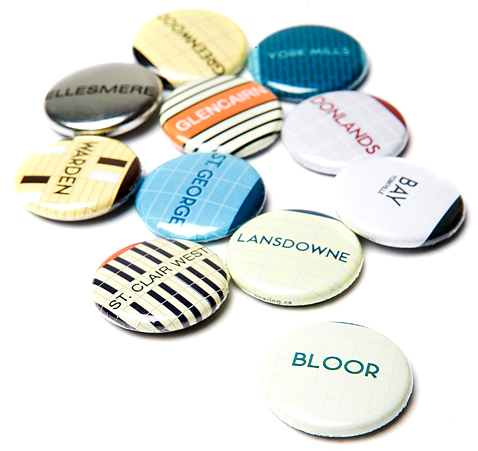
Are Torontonians lucky to have the TTC? Or is it the other way around? In 2005, Spacing magazine introduced a series of buttons commemorating Toronto's subway lines - featuring tiles and type unique to each of the stations. Believe it or not, the TTC actually opted not to market these pins. The TTC's loss was the city's gain. Smart, hip and city-proud these buttons show Toronto at its best: in the hands of its citizens. Available at Swipe books.


TD Canada Trust continues to make Canadian South Asians feel welcome, as our latest spot for them shows.

The premise here is equally simple and incredibly relevant - i.e. TD makes mortgages comfortable, desi style. Instead of the anxiety of negotiating your first Canadian mortgage in a completely unfamiliar setting, TD's mortgage process makes you feel at home. With mortgage specialists who come to you, who get you, who speak the same language as you figuratively and literally.

It's one reason why the majority of desis bank with TD: TD makes mortgages comfortable, desi style.

This idea is demonstrative - TD is not just saying "we get you" it is showing it, in the ad.
(Desi = a person of Indian extraction)


The team:
Client: TD Canada Trust
Agency: Barrett and Welsh

Creative Directors: Mike Welsh and Gavin Barrett
Writer: Gavin Barrett
Art Director: Bhupesh Luther/Gavin Barrett

Directed by: Richard Picton
Executive Producer: Augusta Brook

Editor: Chris Brook
DOP/Colour: Johnny Askwith
Motion graphics: Alwyn Pereira

Music: Night in Lenasia by Deepak Ram, Golden Horn Productions
Sound design: WantedSP, Toronto

Popular Posts

@ Gavin Barrett. Powered by Blogger.

Plagiarism Watch!